AI analytics

Consomme.ai
A conversational AI layer designed to enhance on-site experience and surface real user intent.
AI UX
Conversational Design
Analytics
SaaS
Overview
Consomme.ai brings AI-powered natural language interaction directly onto websites. It helps users find answers faster and gives businesses visibility into real user intent, what people search for, struggle with and expect from their online experience.
Role: Lead Designer (IC)
Timeline: 2 months
Team: 2 engineers, founders and me
What I did:
Designed the complete AI conversation UI
Built the navigation + highlight interaction model
Designed the dashboard and setup flow
Developed the system for fallback responses and context reuse
Led UX exploration, prototyping and micro-interaction design
Helped shape product narrative and website positioning
Context & Challenge
As AI chatbots and AI-first search tools become common discovery channels, users often get the answers they need without visiting the website itself. This creates several problems:
Users get answers elsewhere and skip the website entirely
Websites lose visibility into user intent
Conversion paths weaken
Content investment generates lower ROI
Businesses have no idea what users are actually seeking from a design perspective, the challenge was bigger than traffic loss.
It raised a fundamental question:
How do we reclaim the user’s journey and bring meaningful conversations back to the website?
Design Context - Core UX Challenges (AI UI)
Designing the AI assistant was less about visuals and more about solving the structural UX flaws of chatbots. We identified four core challenges that shaped the direction.
Chatbots separate answers from the interface
Chat happens in a box → Content lives on the page → Users must bridge the gap.
Chatbots feel intrusive and visually dominant
Users treat them like pop-ups. They interrupt. They demand attention. They get closed immediately.
3. AI behavior must be predictable to build trust
If the page scrolls or moves unexpectedly, users get disoriented or skeptical.
4. Highlighting must guide attention without overwhelming
Highlight too aggressively → distracting
Highlight too subtly → meaningless
Key Design Decisions (Summary)
Core UX Innovations
Connect conversational intent directly to the interface
Use three indicators to make AI actions legible
Use highlighting as the primary attention-guiding mechanism
Keep the assistant ambient and non-intrusive
Design Context - Core UX Challenges (AI UI)
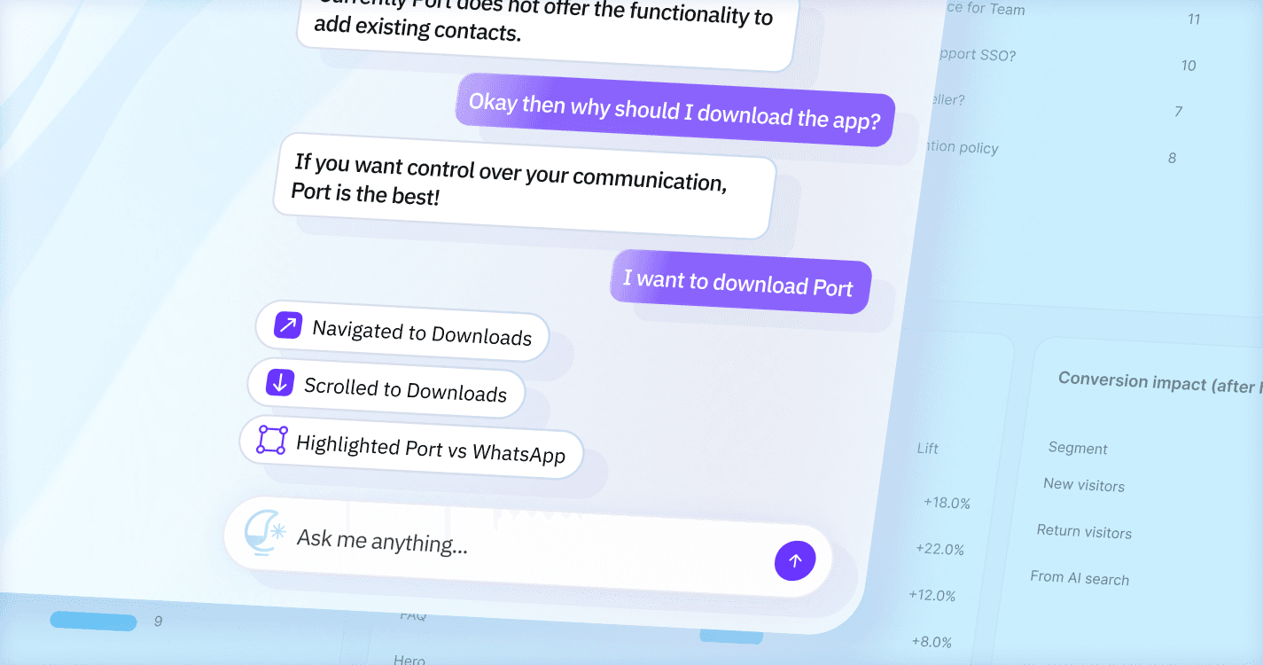
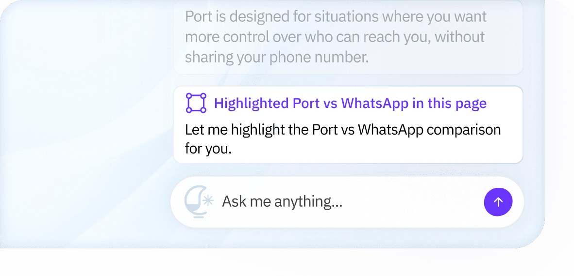
Auto-Navigation + Highlighting
The assistant doesn’t just reply with text, it acts on the page.
Users ask a question
The site scrolls to the right section
The relevant content is highlighted
3 cases of guiding users
1. where it navigated to,
2. where it scrolled to,
3. what it highlighted, giving live context
Navigation bubble
Scroll+highlight
Visual Exploration
Desktop
Designed the assistant to feel ambient and non-intrusive, appearing only when needed and staying out of the way otherwise.
Kept the UI lightweight and minimal so it doesn’t compete with the website’s content or layout.
Treated the assistant as a supporting layer, not a primary interface, so the website remains the hero.


Light variation

Dark variation
Dashboard Experience
The dashboard was designed to be simple, familiar, and easy to collaborate around. Rather than introducing new patterns, we intentionally leaned on established SaaS conventions so users could focus on understanding insights, not learning the interface.
Key UX Priorities
Keep setup and navigation straightforward
Reduce cognitive load for non-technical users
Make insights easy to share and discuss across teams
Help users move from understanding to action quickly
The dashboard needed to work equally well for founders, marketers, product managers, and engineers, often looking at the same information together.

The Core Challenge: Making Insights Accessible
Most analytics tools rely heavily on charts, graphs, and metrics that require interpretation. While powerful, they often slow down understanding and exclude non-technical stakeholders from the conversation.
Our challenge was different:
How do we convey user intent in a way that feels human, collaborative, and immediately actionable?
Our Approach
We centered the dashboard around insights derived from natural language input, not just numerical signals.
Instead of showing raw data, we used text-based insight cards that:
Reflect what users are actually asking in their own words
Surface richer and more authentic intent signals
Explain what the insight means in plain language
Include clear CTAs that suggest what to do next
This allowed anyone on the team to quickly understand what’s happening on the site and participate in decision-making, without needing to interpret charts or dashboards.
Outcomes
We tested the experience with 8 pilot websites to validate the core interaction model.
What Worked
Ambient, non-intrusive AI outperformed chat-based UI patterns.
Highlighting content in-context proved more effective than explaining it.
Plain-language insights enabled faster, more confident decisions.
Key Takeaways
Showing actions in the interface builds trust faster than text-only responses.
Highlighting is more effective than explaining when guiding users through content.
Presenting insights in plain language makes analytics accessible to non-technical and collaborative teams.
What We Validated
Ambient, non-intrusive AI UI scales better for real browsing behavior.
Connecting conversational intent directly to the interface improves clarity and follow-through.
