This is where I built Port UI from the ground-up


How do you get someone to download yet another app and change how they think about messaging?


Part-1: Leadership
Designing Clarity for the Team
Context
Port was a privacy-first messenger that helped people connect without sharing phone numbers. As Head of Design, I was not only shaping the product but also shaping how our team thought, built, and communicated. We were a small, high-stakes team trying to create something genuinely new in an already crowded space.
India became our litmus test because if you can convey value to an Indian user, you have achieved true clarity.
What Leadership looked like
Turning chaos into systems
We were deep in startup chaos with shifting priorities and new hypotheses every week. My role was to turn that noise into something repeatable and clear:
Built a design system from scratch to bring speed and consistency
Created naming conventions and review rituals that engineers actually liked
Aligned weekly with founders to translate vision → shippable flows
Cross-functional translation
Startups are bilingual environments where product speaks in numbers and design speaks in empathy. I learned how to translate between the two, pitching user logic to investors and translating investor logic back to designers.

Building confidence in a new category
We were introducing the idea of numberless messaging, and most people had no reference point for it. I had to design the narrative as much as the interface, building conviction within the team before we could expect it from users.

Part-2 : Design
Navigating Mental Models

Core UX challenges in rethinking access, identity, and connection
Port wasn’t just a new messaging app. It challenged some of the most deeply ingrained assumptions people have about communication: that connections are permanent, phone numbers are necessary, and access is all-or-nothing.
Designing Port meant navigating unfamiliar mental models while keeping the experience approachable, especially for users encountering the product for the first time.
These were the core UX challenges I designed for :
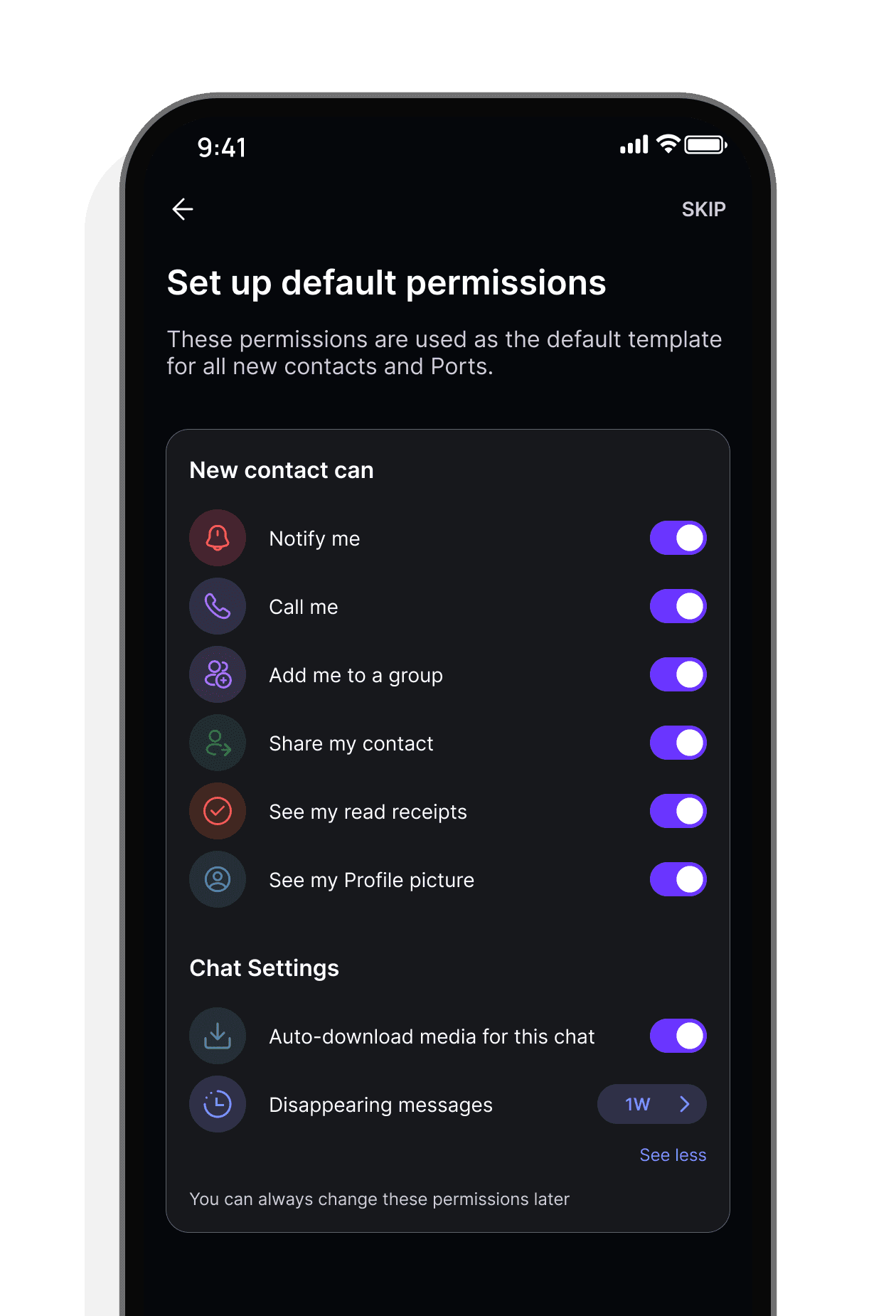
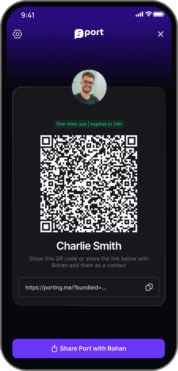
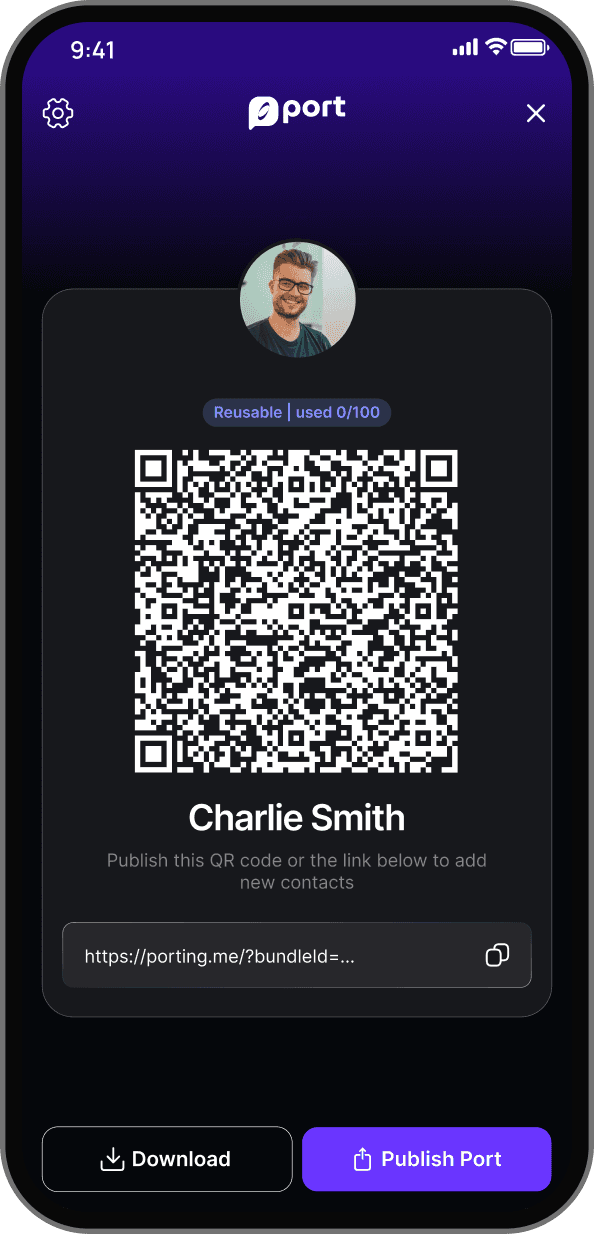
Designing control before connection
In most messaging apps, access is assumed. Once someone has your number, they can reach you anytime. Control exists, but it usually shows up later as blocking or muting.
At Port, access control wasn’t a setting. It was the core idea.
This created a new UX challenge. We weren’t just adding options inside a chat, we were asking users to think about reachability before they connected with someone.
I designed access controls to live directly in the chat experience, where they felt visible and relevant rather than hidden away. Just as importantly, I designed moments before a connection was made to gently explain what these controls allowed and why they were useful.
The challenge wasn’t making access powerful. It was making it understandable. We had to show its value without making the experience feel complicated or restrictive
Click on the screen to see how it works
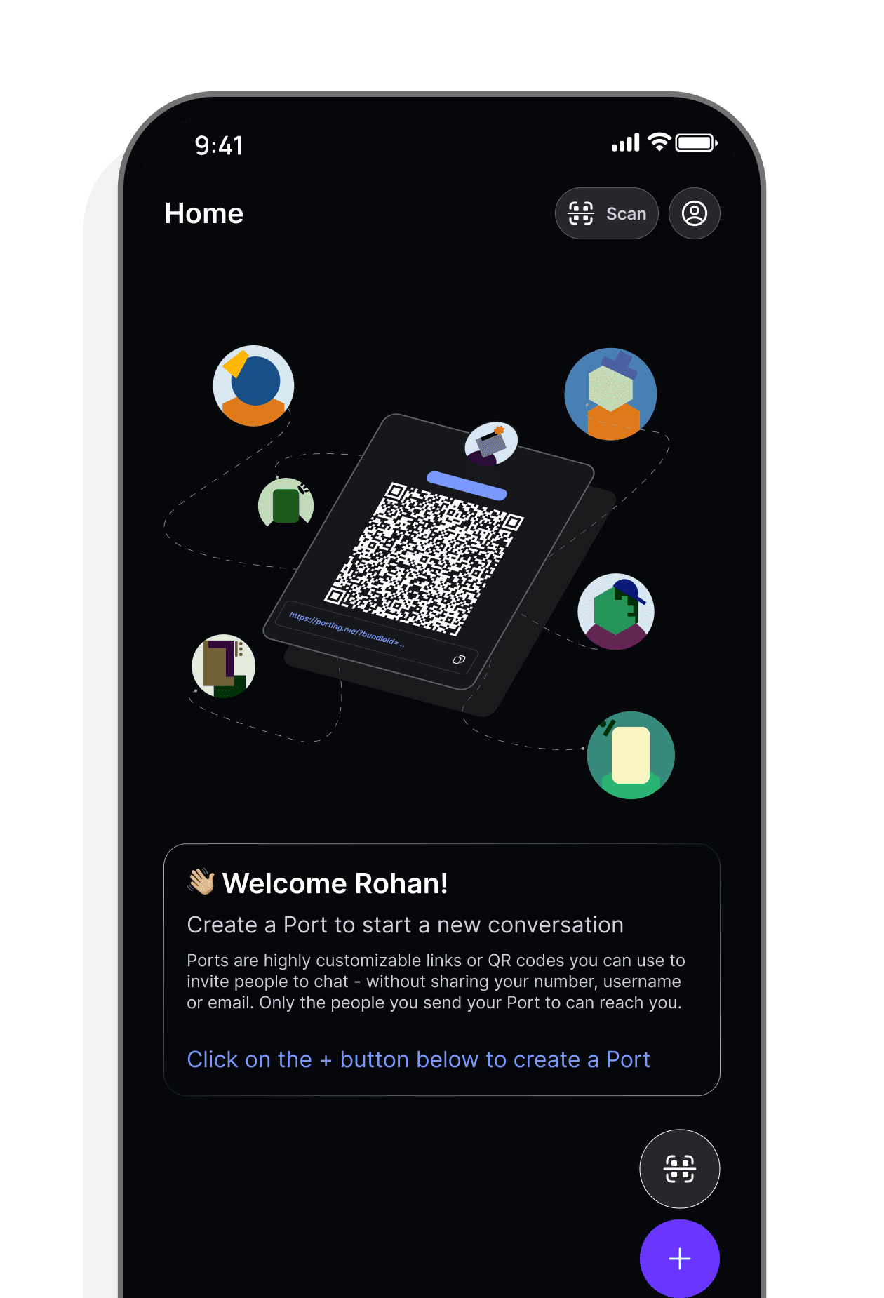
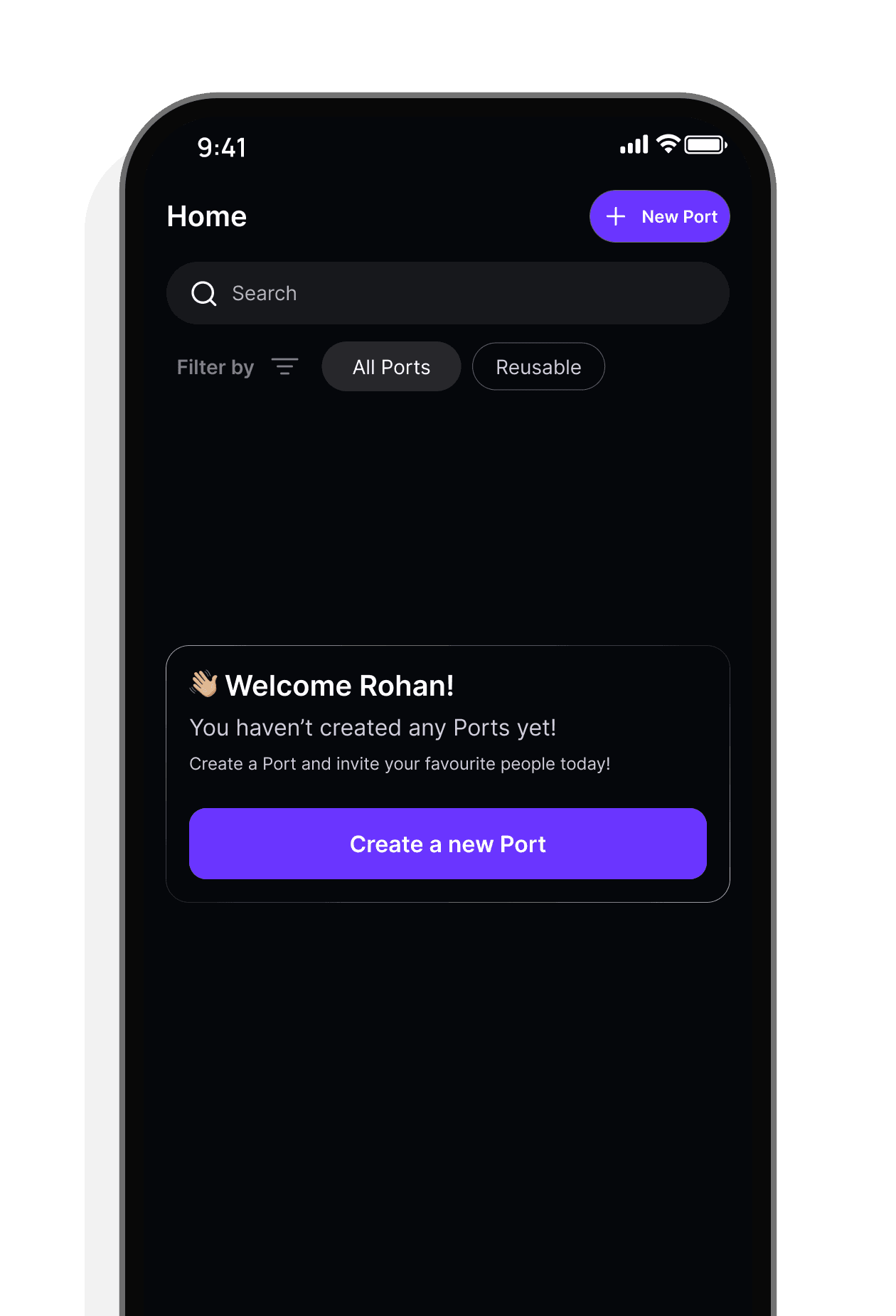
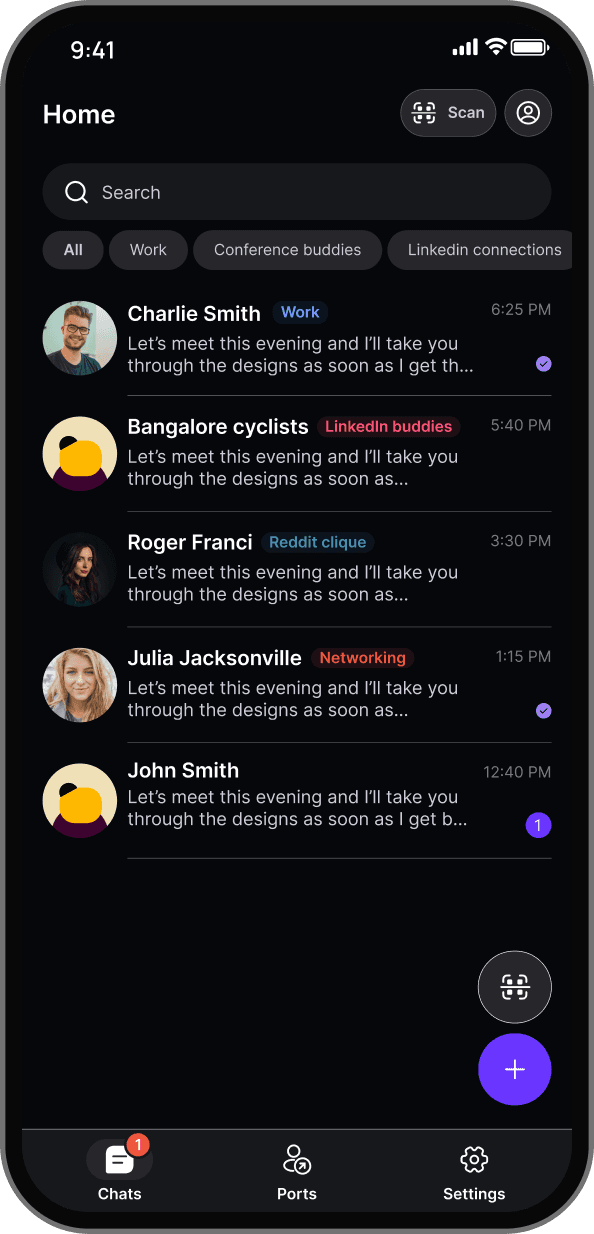
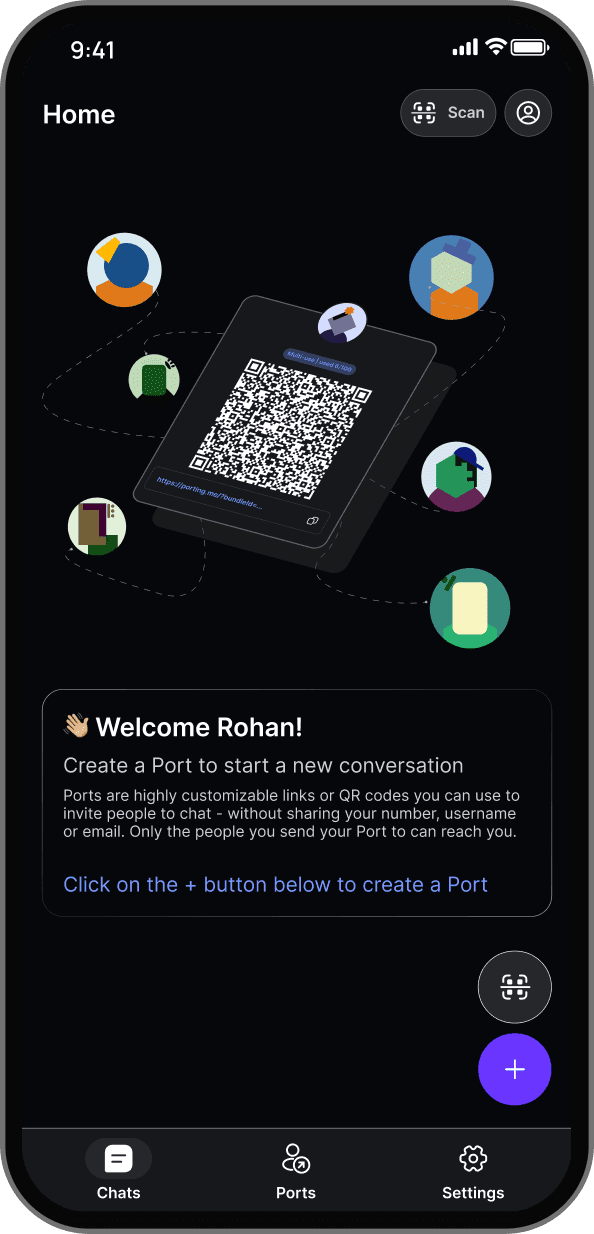
2. Organizing connections without phone numbers
Phone numbers quietly hold messaging apps together. They help with naming, memory, and context without us ever noticing.
Port intentionally removed that layer.
As people started connecting through multi-use Ports, contact lists grew, remembering who was who, and why a connection existed, became harder especially in work or event-heavy contexts.
Instead of rebuilding a traditional contact list, I designed a way to add context before the connection even happened. Users could tag a connection as work, conference, or personal upfront, so they always had context.
This shifted organization away from identity and toward intent, making numberless conversations easier to navigate over time.

3. Explaining and scaling numberless communication
“Numberless messaging” isn’t a familiar idea. Even when users liked the concept, they often wondered how it worked in real life and how to explain it to someone else.
This created a dual challenge: making the idea easy to grasp, and making it easy to share with people who weren’t already on Port.
I treated the website as an extension of the product, not just a place to describe it. Instead of asking users to explain Port themselves, the website helped introduce the idea at the moment of connection.
Links and QR flows didn’t just connect people, they quietly explained what was happening and why it mattered. This made first-time interactions feel clearer and helped Port grow without relying on phone numbers or heavy onboarding.
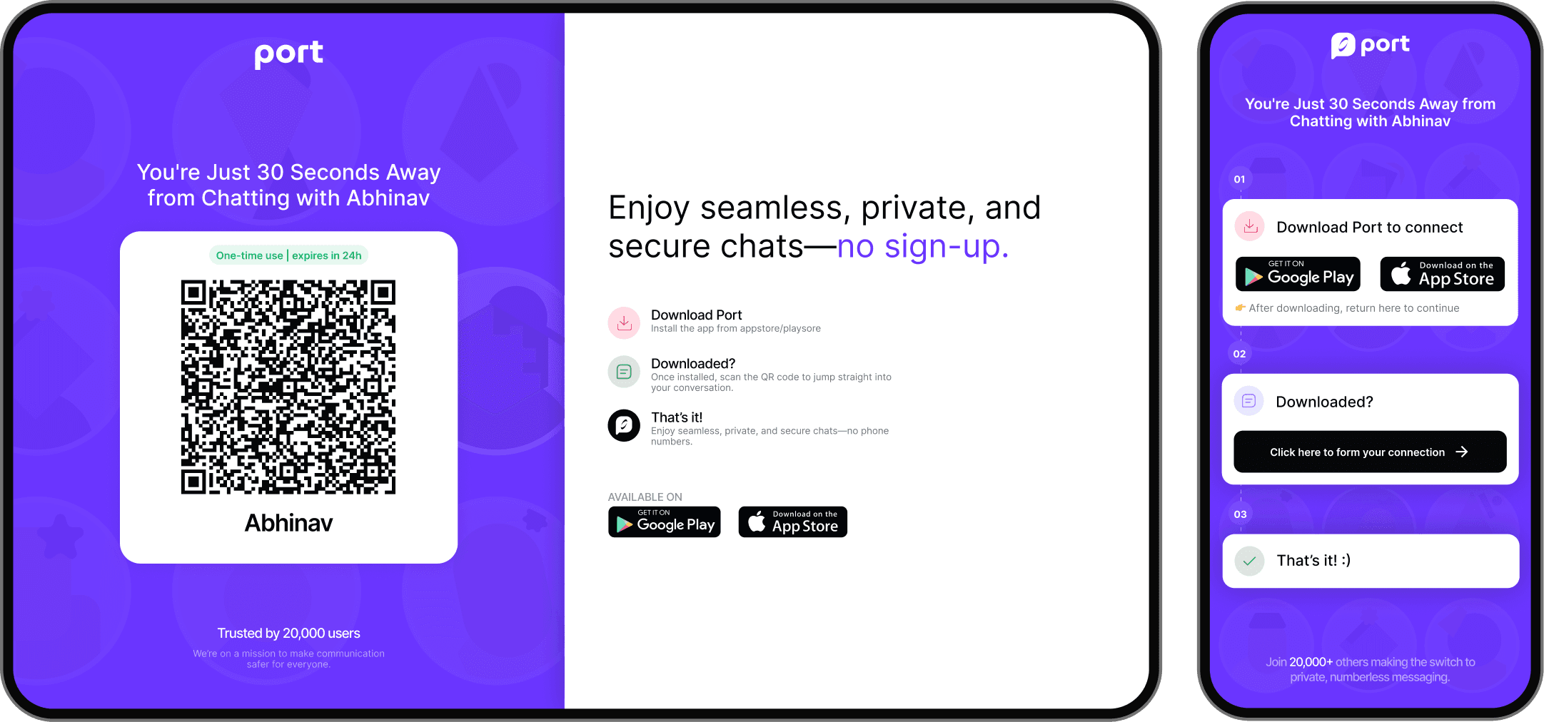
First time users connecting over a Port link are navigated to our desktop/mobile viewport depending on where you clicked on the link
Part - 3 : Designing for diversity
Platforms, contexts, and real-world constraints
Designing Port for a global and diverse user base introduced constraints that shaped every decision.
IOS vs Android
iOS and Android users have different expectations around navigation, control visibility, and interaction density. Access controls, tagging, and connection flows needed to feel natural on both platforms, even when the interaction patterns differed.
Rather than forcing identical behavior, I focused on keeping the intent consistent, allowing the interaction to adapt to platform norms.
Context diversity in how people connect
Users weren’t just chatting with friends. They were connecting at conferences, workplaces, communities, and public settings. These contexts demanded different levels of control, clarity, and reversibility.
Designing for this diversity meant prioritizing:
upfront clarity over hidden settings
contextual actions over global defaults
education embedded in flows rather than documentation

Why These Challenges Mattered
None of these problems had existing patterns to copy. Each required balancing:
novelty with familiarity
control with simplicity
privacy with approachability
Designing through these challenges shaped Port not just as a product, but as a different way of thinking about connection.